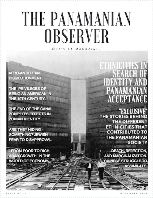
While creating my magazine cover I took into account contrast, consistency, layout and comprehensibility. I made sure that my cover wasn’t too full of unnecessary stuff that took out valuable space, everything in my magazine cover has a purpose, my background, colors, cover lines, main cover line, flashes, and heading.
I choose the picture in the background because it shows how Panama has evolutioned over time thanks to the contribution of these different ethnicities. The picture shows a black and white Panama a place were everything was divided in two, like the gold (high class) and silver roll (low class). Everything was a mess, the ground looked destroyed, it was a dark past, this image also gives credit to the different cultural groups and made them look valued due to their contribution to society.
I decided that my heading was going to be “Ethnicities in search of identity and Panamanian acceptance” because all of these ethnic groups had a though time assimilating into the Panamanian society, their culture and identity had to change in order to be accepted, because of this, many of them suffered a lot in Panama. As well, this heading had a strong relationship with collective identity and how these groups perceive themselves in relation to society.
My main cover line starts with a flash, I chose “exclusive” because I think it catches the attention of the public and makes it sound like you have to read it now, then it says, “The stories behind the different ethnicities that contributed to Panamanian society” I think this would catch a reader’s attention because you always hear a lot about many great constructions like the Panama canal, but you don’t hear much about who actually built it, the workers, and how they suffered throughout time.
I created my cover lines so that they sounded like a summary of the articles with a deeper since of identity, I think they are great and I would definitely want to read them because of the power they were given due to my selection words, I love them!
For my text I chose the colors black and white, this colors obviously contrast and make each other stand out which I think made the text readable and good looking. I also believe it made the cover look ancient which I believe is good because Panama has changed a lot since then, now it’s more diverse, it’s more colorful.
Someways I could improve for next time are choosing an image that looks more appealing to the public, because even though I chose the image for a reason it doesn’t really grab your attention in an instant, this could have taken away attention from my heading, and cover lines . I would also add a bar code.